Happi Mynd is an organisation that helps users take care of their mental health through unique, digitally empowered tools that are accessible, affordable and reliable. They believe that physical well being is emboldened by a healthy mind and help users prioritise their mental health and their overall health via a range of customised and confidential technological offerings.
Brochure
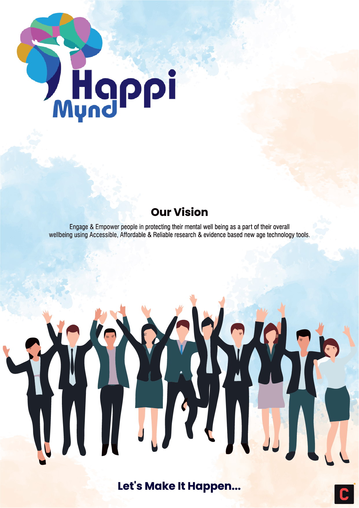
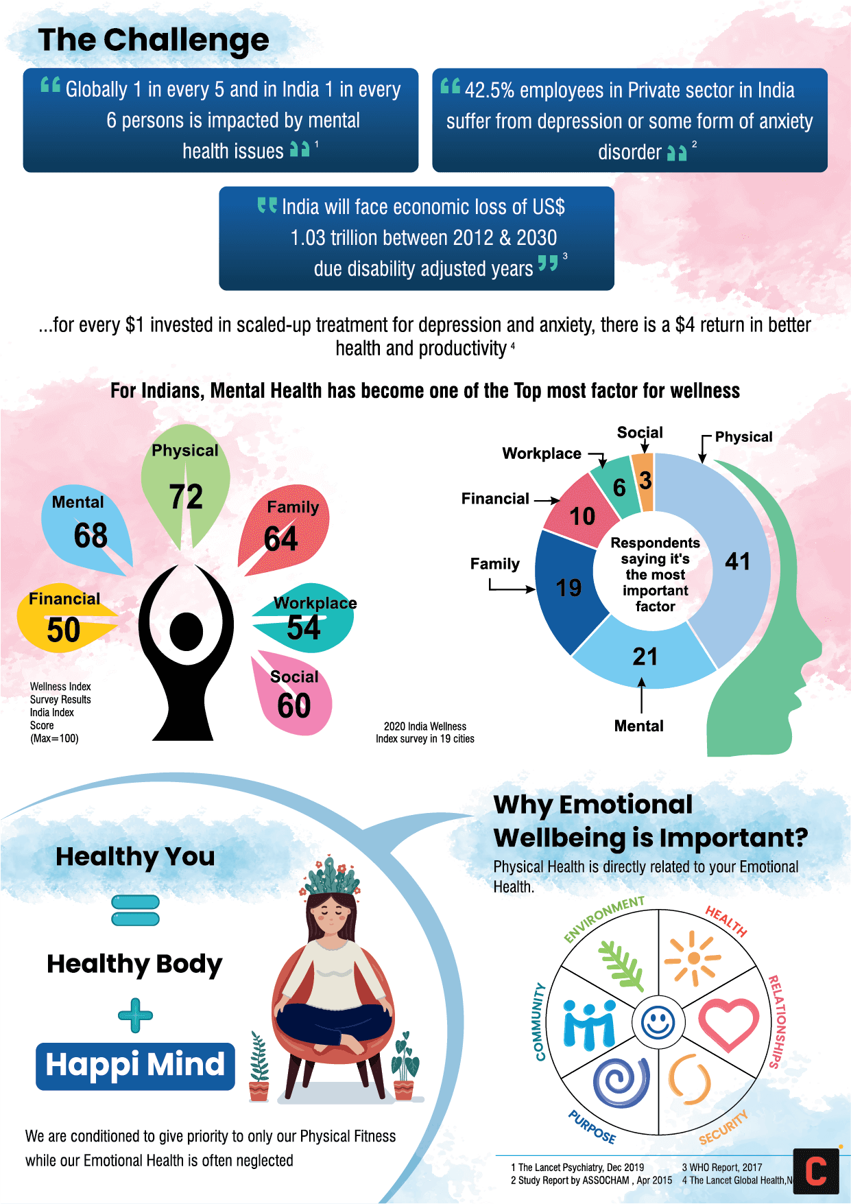
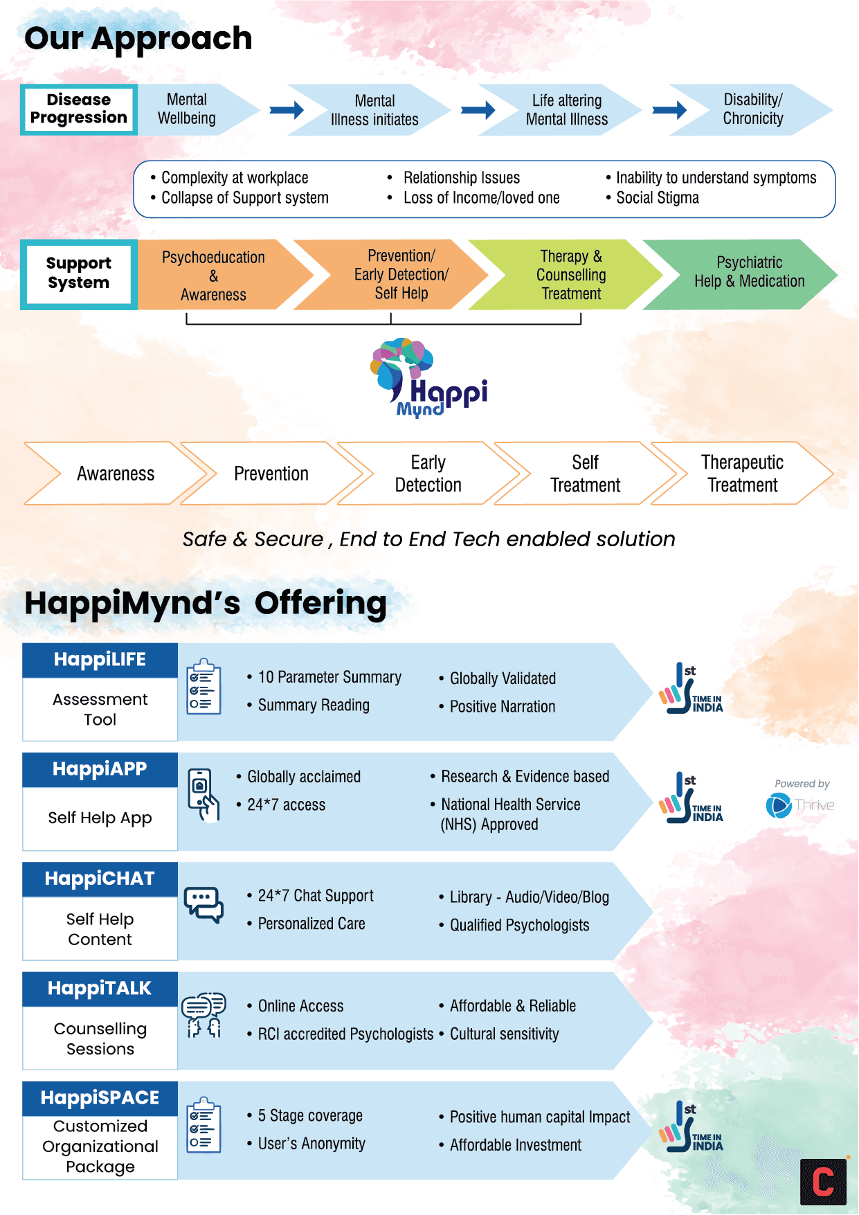
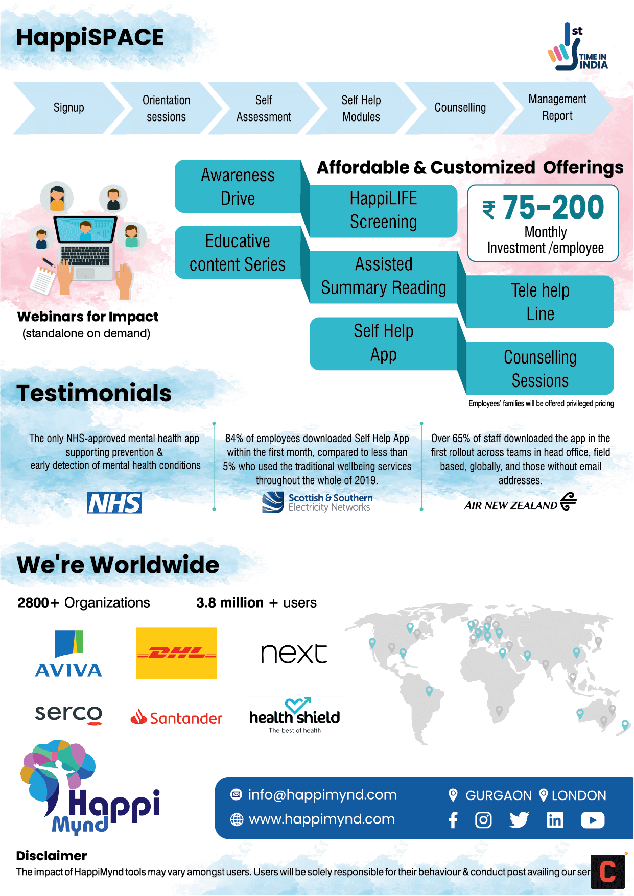
To conceptualise Happi Mynd’s brochure, we took inspiration from the brand logo, which consists of a human silhouette amidst a myriad of colours. Our goal was to put together factual information about the importance of mental health with the brand details without making it look too cramped, for which we imposed a bunch of colours with reduced transparency that gave it vibrancy without taking the focus away from the main content.
We incorporated the same colour scheme with the rest of the content in the brochure, employing a varied palette of colours to highlight the multifaceted offerings of the brand while also emulating the vibrancy of the brand logo.
Prev
Next

Prev
Next
Poster
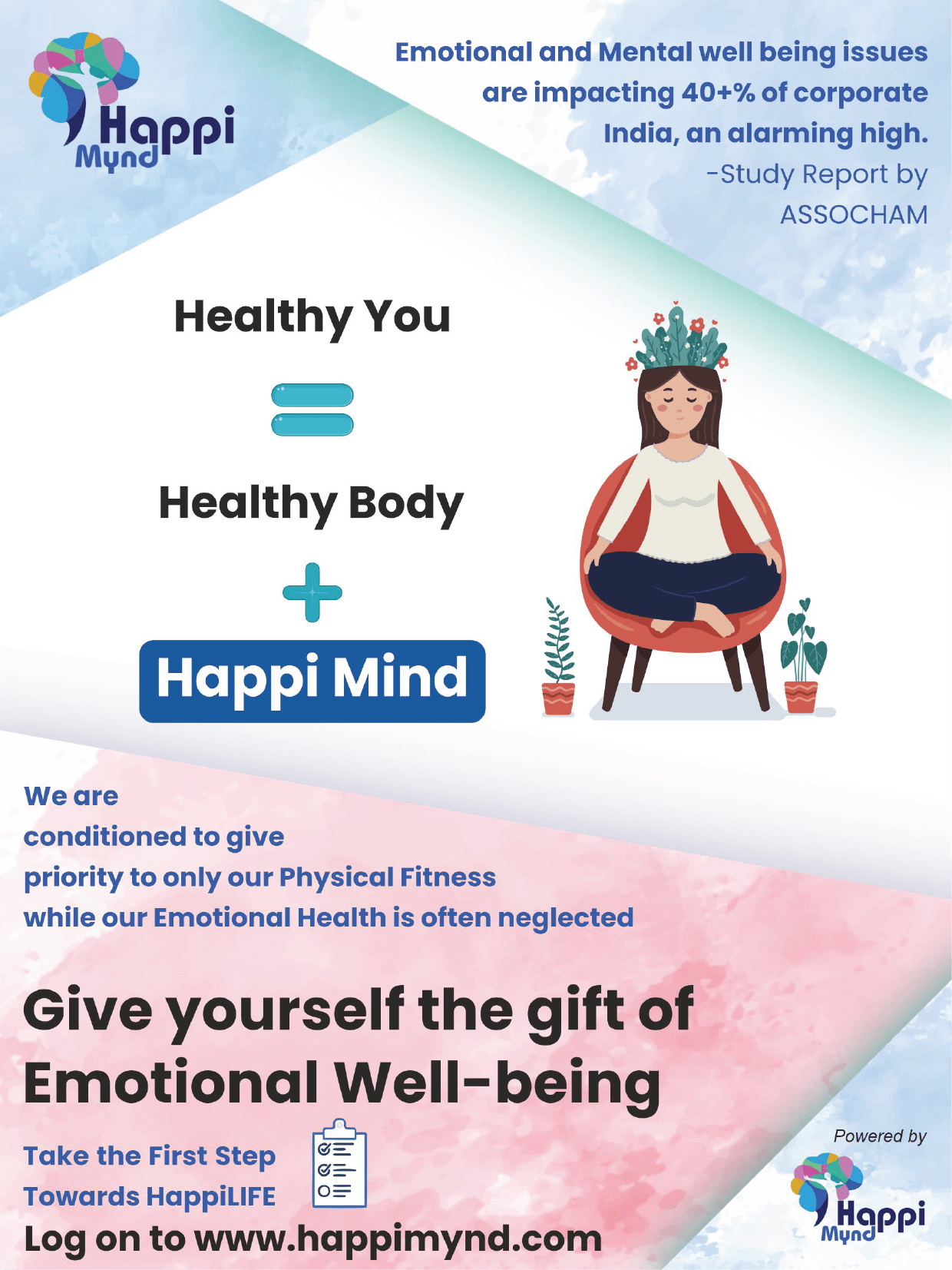
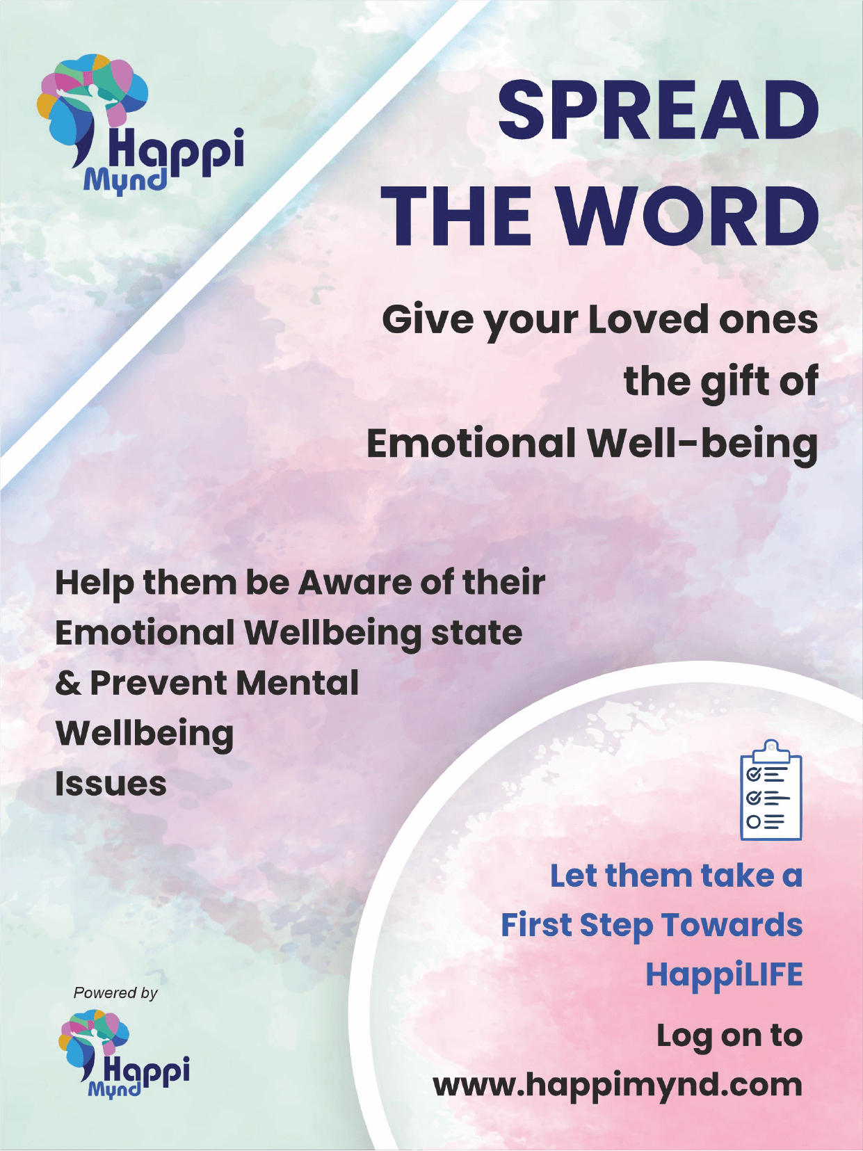
We conceptualised three posters for the brand, each highlighting the unique selling point of the brand in different ways. Maintaining the same colour scheme as we did in the brochure, we created three posters – two with call to action (CTA), urging people to take a step towards a healthier mind, and one poster featuring the unique features of the brand.
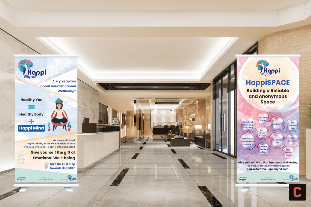
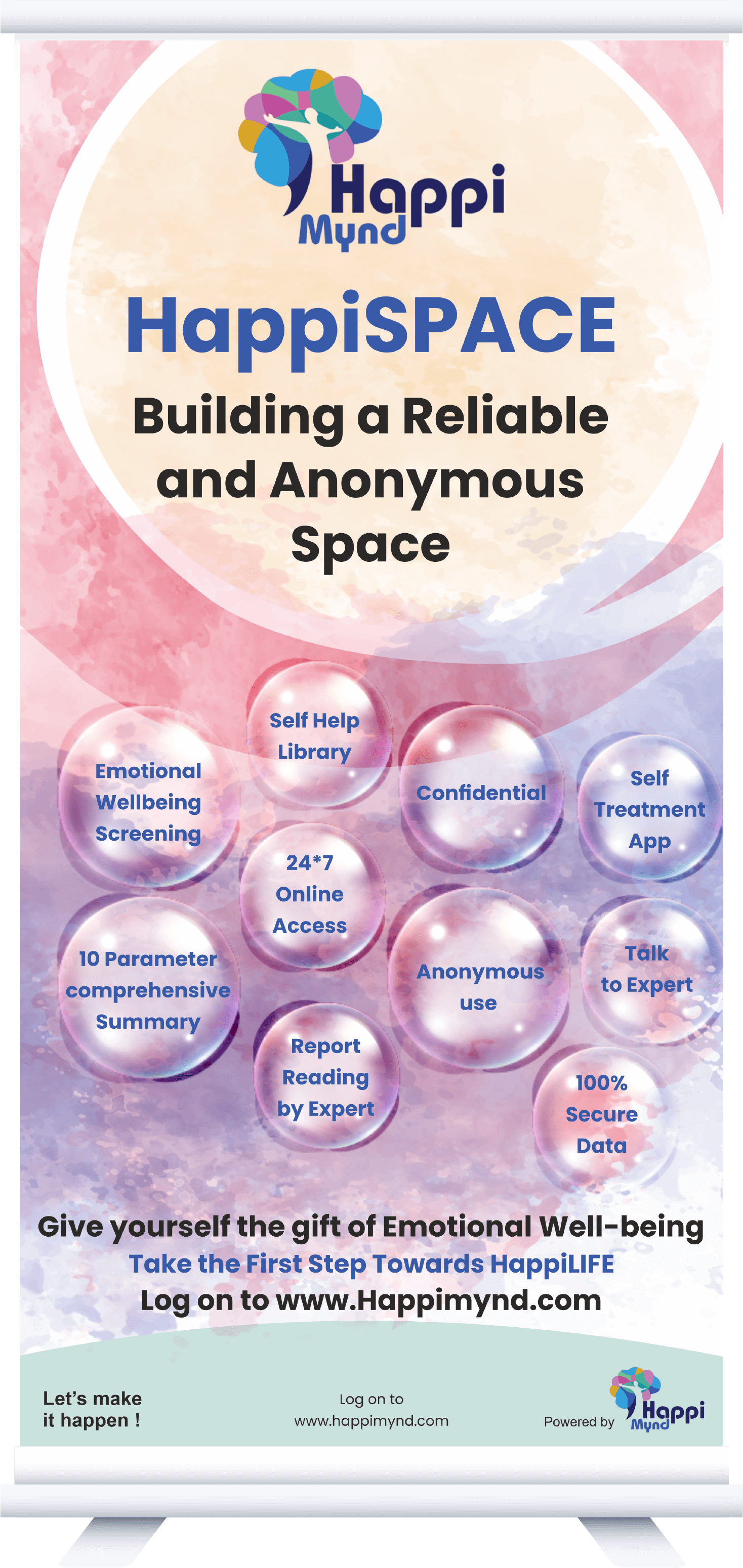
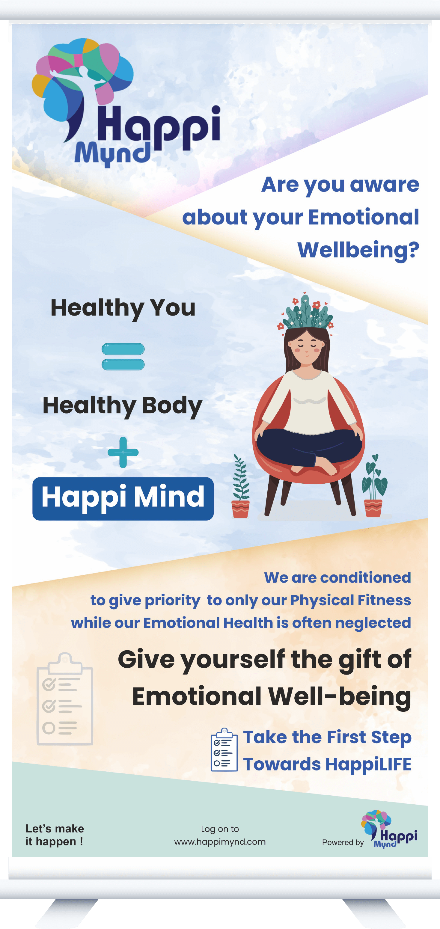
Standee
We created two standees for the brand, both with different colour palette backgrounds synonymous with the brand logo. One of the standees was conceptualised to give the viewers a CTA, while the other called attention to the unique offerings of the brand.
Prev
Next
Video
We created a 1:30 minute stock footage video for Happi Mynd, which comprised info graphics, motion graphics and elements that brought out the brand offerings in crystal clarity. Additional text and background score were added as per necessity. We also added a voice-over in the video keeping it mild and calm throughout, to maintain a constant tonality.
Our Other Case Studies
Brainflex 360
As a student, we have all gone through days when we have been fully prepared for an exam but still gave an underwhelming performance. Some of us never really found out the reason behind it but gladly, Brainflex360 did.
Niji Books
This process helped Niji Books and us to have a common alignment of understanding the branding process. Once the brand personality traits were identified we moved further in creating the visual imperatives.

Techmentry
This time it was Techmantry who wanted to have an easily understandable but out of the box visual representation in the video format. We started with what we do, primarily. Brainstorming. With plenty of ideas colliding and merging, it came to a conclusion that a brand mascot is must.